Data visualization is very important in presentations because it turns the raw data into something that is simple to understand. PowerPoint graphs and charts are an excellent way to show information visually, allowing an audience to understand and focus on what you are saying. There are lots of types of graph in PowerPoint, so it’s important to choose the type of graph that suits your data and simplify your graphs so the audience doesn’t have to work hard to understand your message.
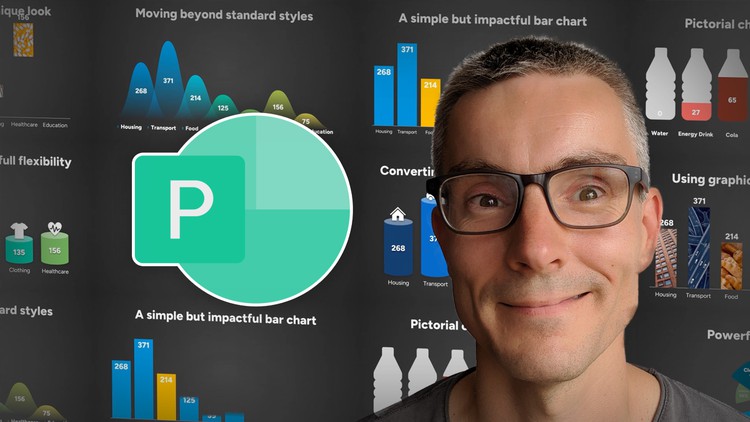
Hi, I’m Alan, a presentation designer who’s been using PowerPoint for over 20 years. In this course I will to show you how you can quickly make easy changes to charts to improve how you present your data with impact.
We will look at bar charts, pie charts, pictorial charts, key data point charts and proportional area charts and in each example, show you how some simple changes can make your data stand out.
In most examples we will keep the data ‘live’ in PowerPoint so it can be easily modified at any point,
but I will also show you how you can convert charts into shapes to give you full flexibility on how you want the chart to look and take your design to the next level.